Sigma ART vs. Nikkor AF-D Test Part 1 : Sidelight Studio Controlled Test

Some camera porn for upcoming articles (what is the Voigtlander doing there?!)
This article is an applied test based on theories explained on
Download the uncompressed test files here for better viewing
Over the past few months, I found that knowing the truth and explaining it well are two different things. Ever since I embarked on this journey of depth and micro-contrast rendition, I’ve been trying to show it to many of my friends and now many of us on this blog. While some technical communities lacked the perception of such, most of the positive responses came from various peers and artists who knew there was “something” in binocular lenses needed technical terms to further explain their feelings. Anyhow, I suggest now the coldest of ways to compare lenses: a controlled studio test.
The observed claims
Lens Diagram, click here to learn more
- Optical correction by element count as well as using ED and ASPH glass reduces depth rendition
- Optical correction by element count reduces micro-contrast
- Micro-contrast is tonality NOT resolution
The setup and replicable procedure
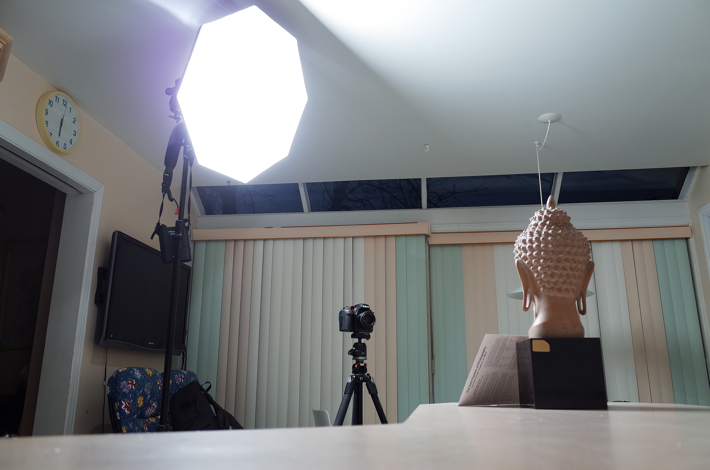
To effectively build the test requires a way to make the subject pop regardless of the lens’ construction as it gives a fair chance for the eyes to identify all the possible visual cues of depth and micro-contrast rendition. Thus, a nice creation of a graded shadow. The rest of the variables need to be locked, constant and reproducible for future tests. I have selected both the 35mm and the 50mm lenses as those offer "normal" vision and can achieve stronger differences in rendition unlike wide-angle lenses which require a better balance of correction by glass element and superior micro-contrast coating.
Here are the materials:
- Nikon D750: wb locked at 5560K, shutter-speed locked at sync speed, aperture locked at f5.6 for peak sharpness, RAW Recording at 14-bit lossless compressed
- Nikkor AF-D prime lenses of 35mm and 50mm: low-element count prime lenses
- Sigma ART prime lenses of 35mm and 50mm: high-element count prime lenses
- Manfrotto 190xProb Tripod with 486rc2 ball head: a reliable tripod setup locked tight in same position
- 18% Gray Card by Delta 1: evens out the color shifts of each lens
- Godox AD360 Flash kit: fires at equal power of both lenses.
- Westcott Rapidbox Octa: for a pleasing light on our subject
- A Buddha statue head: enables texture, roundness and depth recognition. Focus was done on the closest eye by live view at maximum magnification.
- The kitchen: enables geometrical cues in the background to help identify micro-contrast
If you were to perform blind testing without knowing the results or do not believe any of this, you can stop reading here.
Download the RAW, the personally rendered TIFF and the side by side PNG files (500mb) to come to your own conclusions. These contain well labeled files. Here are the steps I used to witness the differences. Download here.
Preparing the files
- Import them in LR
- In Develop Module, apply Camera Standard camera calibration profile
- Leave lens distortion correction to OFF
- Even out white balance using WB droplet in the same position on the gray card
- Convert to black and white (v button)
Observing depth rendition
- Even out exposure by raising or lowering the exposure on one of the files
- Interpret the depth rendition differences
Observing micro-contrast
- Lowering the exposures by two stops relative to previous exposure correction
- Export Tiff files (because Lightroom compare will go crazy)
- Open them separately in Preview (yeah, Preview okay?)
- Interpret the micro-contrast differences
I shall then process to the test and my own interpretations of it.
I used Lightroom 5.7 on the Mac OS El Capitan Macbook Retina 15 system. The perceived observations were made from a Datacolor Spyder3pro Calibrated Dell Ultrasharp u2412m screen.
The lenses
I shall first describe what I see without telling you which side is which. Then reveal the lenses at the end of each observation.
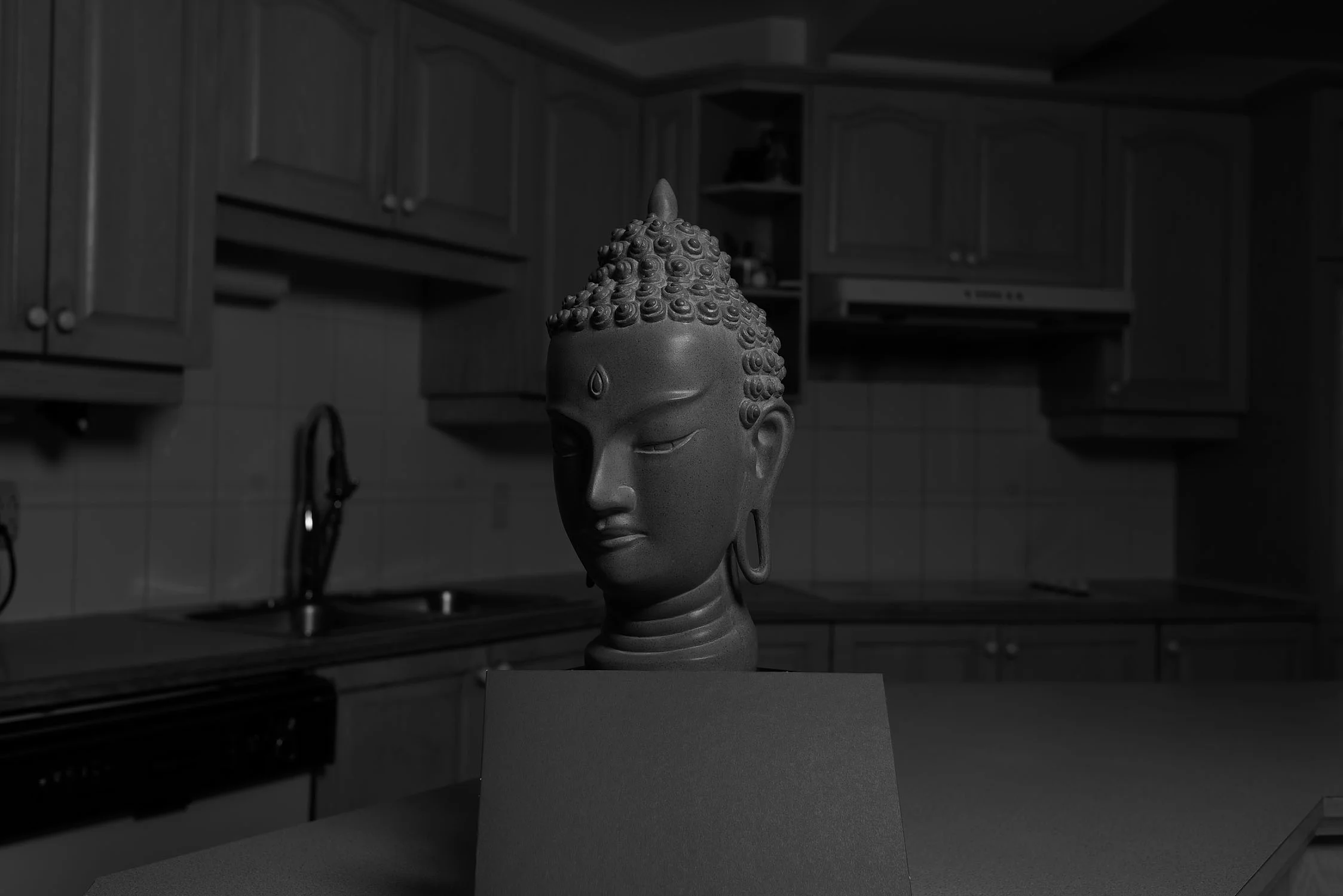
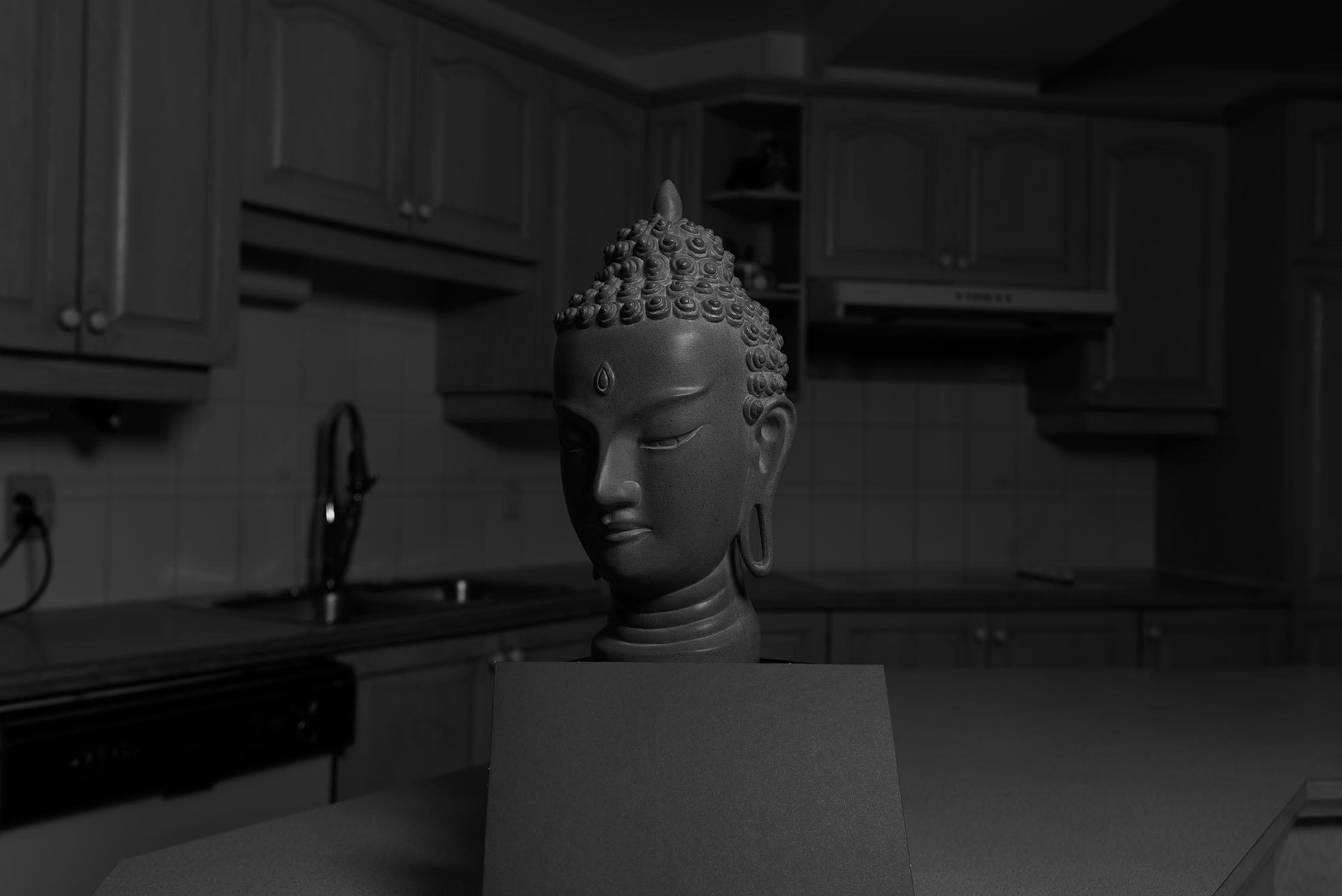
35mm detailed observations on depth rendition


Despite being shot from the same position, both lenses do not record the same field of view. One of these seems to be wider or to give the impression of the behavior of a much wider lens. The kitchen cabinetry is pulled back much more on the right image. Lets now zoom into some parts of the image for depth rendition, the nose at 200% (yes I know I love noses)
The Sigma greatly displays its greater resolving prowess. While it managed to find and sharpen every single dot on the face, it also flattened both nose arch, nostrils (lack of highlight) and even the lips by stretching them to the left. The Nikkor on the other hand does not distort the elements and naturally lets them step forward.
While the Sigma is more contrasty, the Nikkor manages to reproduce the fact that the texture is waving forward.
And there you have it: rounder cheeks, rounder neck, unstretched.
The left images is the Nikkor. The right images is the Sigma. Now lets proceed to Micro-Contrast
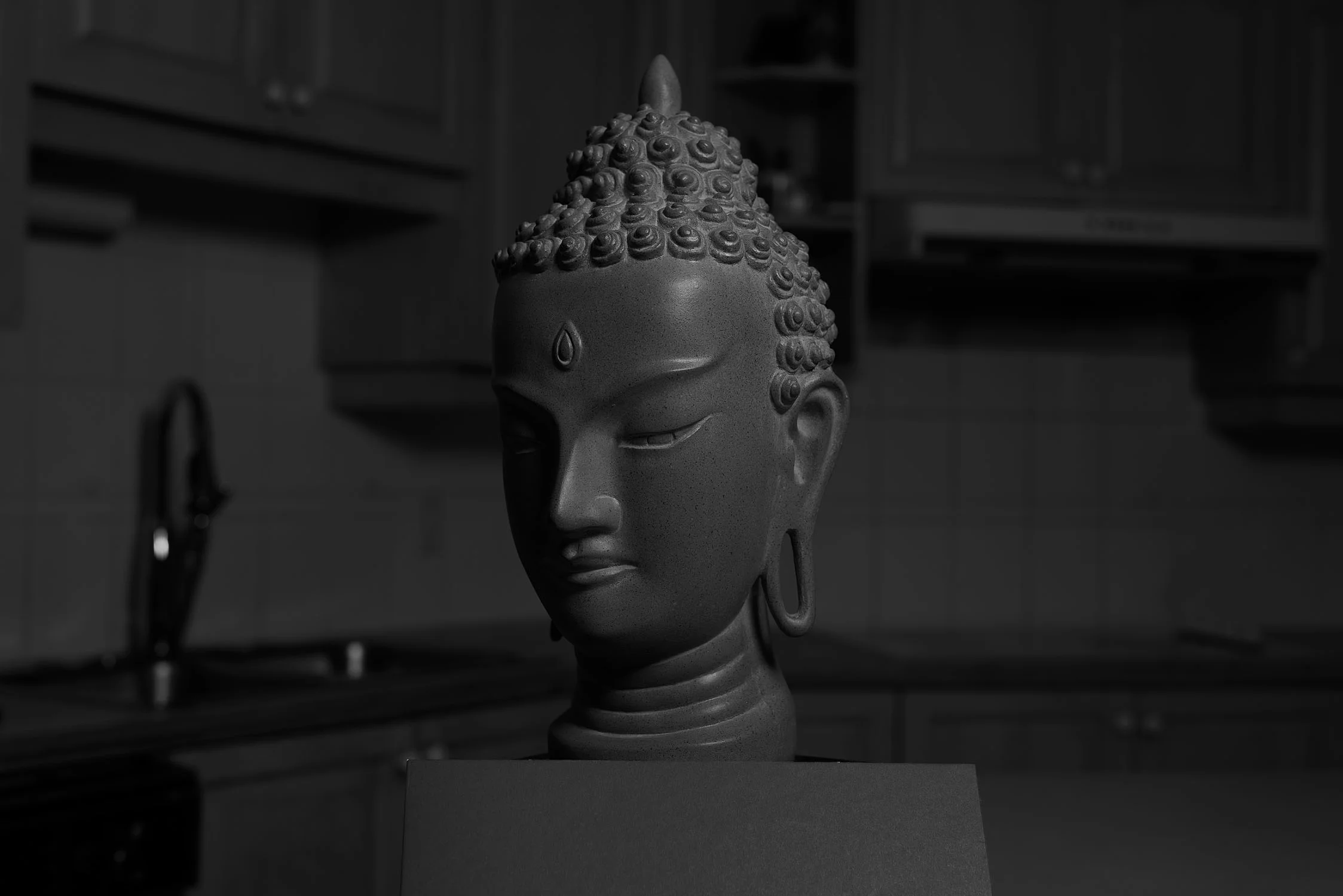
35mm detailed observations on micro-contrast
Now that the lighting has dimmed a lot, we can perceive the amount of tones recorded by each lens. There is a lot of things to point out here. Lets get closer, open the TIFF files and go full cmd-0!
The Nikkor lens still sees a lot of things. Aside from the obvious highlights of the buddha headgear and the tiny little dots on the skin, the Nikkor lens interprets the little tonal shifts of the wooden cupboard on the left of the head whereas the Sigma is utterly blind. Are you starting to see the micro-contrast? Lets look more into that cupboard!
The Nikkor displays a higher level of tonal shifts on the right blurred door. Enough of the left side, lets go to the right side.
Well then, the Nikkor even depth rendered the blurred cupboard! Not only that but the tonal texture of the blurred wood is also recorded by the lens. The Sigma on the other hand is swimming in mud hoping to one day achieve the true blacks of famous black and white photographs of old. I shall spare you the rest of the observations. Are we starting to understand that micro-contrast is tonality and not resolution? Uh-uhhh
50mm detailed observations on depth rendition


If we learned anything from our previous comparison, we’ll clearly recognize that the Sigma 50mm ART also frames wider.
Once again, right image displays a perspective stretch to the left, flattening the nose that gentling moves more forward on the left image.
The Sigma's higher contrast draws the hair more precisely but also stretches the forehead more up right, leaving it flat.
We are beginning to notice a wide angle distortion on the right compared to the standard compression on the left.
The left images is the Nikkor. The right images is the Sigma. Now lets proceed to Micro-Contrast
50mm detailed observations on micro-contrast

Ouuu dark. The tonal shifts are absolutely all over the place on the Nikkor. Lets do some inspecting.
Underexposed, the Sigma still tries its best to resolve the headgear. On the face though, the Nikkor draws the eyebrows out with tonal and textural clarity whereas the Sigma sees faded cream. The Nikkor also distinguishes the subtle tonal shifts in the left cupboard. Do you see the micro-contrast?
The Nikkor depth rendered the blurred white stove nobs! It even manages to render the wood of the cupboard under the stove. I guess the Sigma sees shapes at best.
What we learned
16-85VR, not a 3d lens ;)
- Optical correction by element count as well as using ED and ASPH glass reduces depth rendition
- Optical correction by element count reduces micro-contrast
- Micro-contrast is tonality NOT resolution
- Lenses with less optical correction will yield superior Depth Rendition and Micro-Contrast as long as the glass and coating quality is awesome.
- Modern awesome coating have limits at giving micro-contrast to multi-element flat machines
- You can create good depth using great constant perfect lighting
- Having a nicely micro-contrasty depth rendering lens for when light isn’t on your side is quite nice to have really.
Next article could cover the same setting with diffuse wall-bounced light instead of direct, followed by how such rendering differences affect landscape photography.